/ All Work
Case Study 01 / 03
Veyro
A bold identity and website for a basketball brand, built around one colour and a lot of energy.

01
Overview
Veyro needed to feel like the game itself: fast, loud and confident. The brief was a wordmark and a website that could stand next to the biggest names in basketball without borrowing their look.
Overview
Sports brands tend to look alike: heavy type, dark photos, and the same aggressive gradients. Veyro had to stand out in a crowded space while still reading instantly as basketball.
The Approach
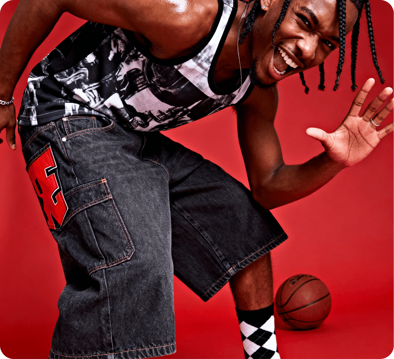
One colour, used with conviction. Red became the whole brand, carried by a sharp custom wordmark and a layout that moves with the pace of a fast break. The home page came first and set the rules. Every page after it follows the same structure and rhythm.
02
Visuals


03
Process
Wordmark first
Everything started with the name. The wordmark was drawn to feel like motion, with sharp cuts that echo the lines on a court.
One page sets the rules
The home page was designed and built first. Its grid, type sizes and colour rules became the system every other page follows.
Colour one hero red with two neutrals
Type bold display sans, editorial serif for stories
Build responsive, animated with restraint
04
Outcome
A brand that's ready to play, designed and built by one person.
01
Custom wordmark and logo system
02
Page templates designed and built
03
Colours in a focused palette
04
Custom, no template underneath